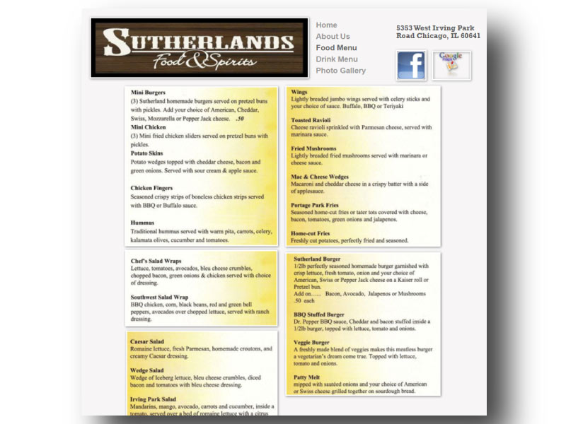
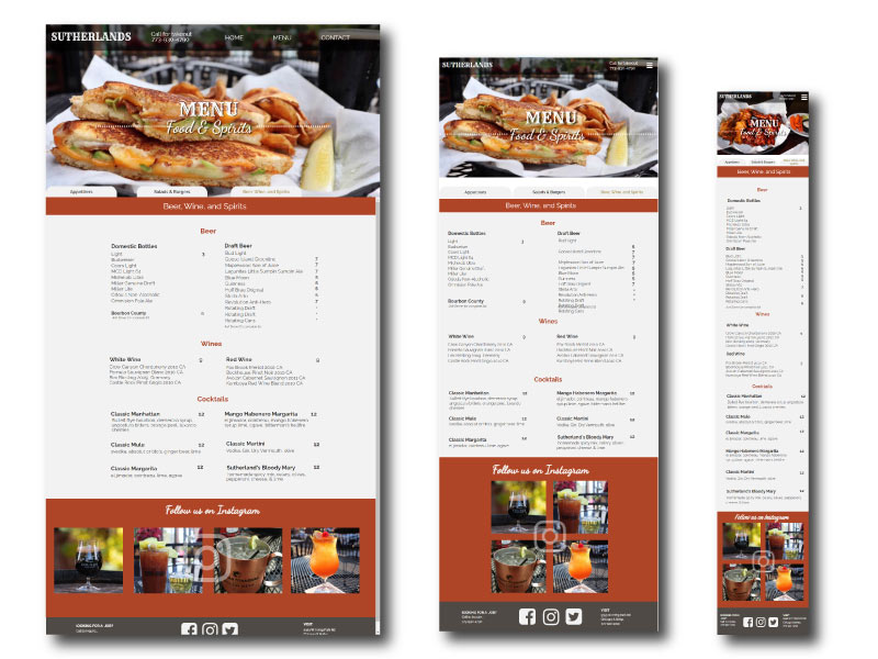
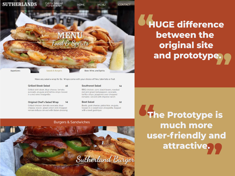
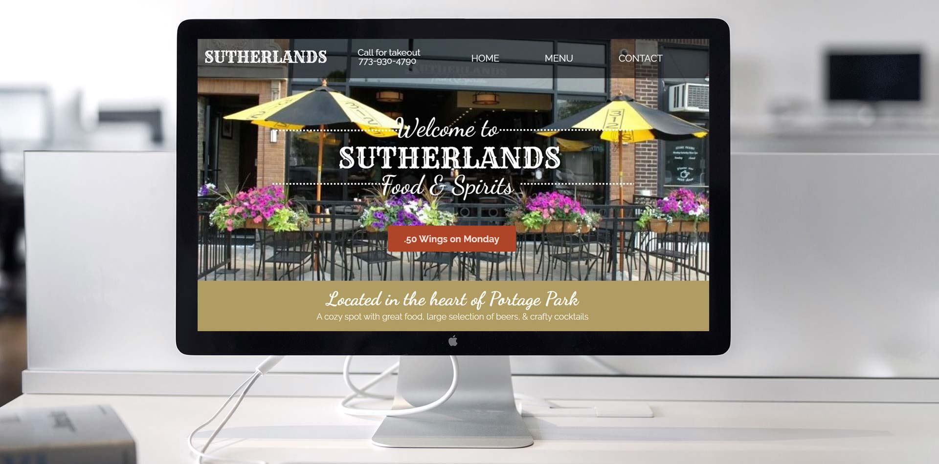
KELLY STARK-VAUGHAN
<h1>Project 1: Website Redesign</h1>

Project 1: Website Redesign

Sutherlands

About the project

This was a semester-long user experience and design project for Web 170 at Harper college, where we chose a site with usability problems to redesign.  I chose a site from a neighborhood pub called Sutherlands. Its online presence didn't represent the warm and inviting atmosphere of the restaurant. 

See Sutherlands website: See Sutherlands website

The Journey Map and Persona

I created a persona, "Alice" to describe in detail the key customers are and why they feel the ways that they do.
Alice's goals:
Find a budget-friendly place for a party.
Alice's Frustrations:
She likes clear information and order, and if it's not there, it frustrates her.
The journey maps showed me what the users did while using the existing site as they interact, including where things do and don't meet their expectations.
Pain Points:
Couldn't find prices and fonts were too small to read.
Solutions:
Create a website that has prices, a full menu with larger font size and plenty of images of food.

The Usability Test:

The Problems:
  1. The user cannot find any prices for food
  2. The user cannot tell if they deliver during the pandemic
The User Goals:
  1. Find the prices for food and drinks
  2. Find out if Sutherlands delivers.
Test Findings: The average time to complete each user goal was around 1 minute.
Notable user comments:
  • "The site would be cutting edge in 1994."
  • "It would be nice to see pictures of customers."
  • "It’s not inviting."
  • "I Wouldn’t recommend this restaurant. If I was trying to lure new people to Sutherlands, it wouldn’t be based on their website."

The Wireframes:

First I created rough sketches for each page for review and critique.

Next, I created the wireframes to show the overall content and interface layout. It was important to maintain consistency across all screens and keep the end-user in mind for all decisions.

The completed wireframes were polished and ready for a client to review.

I used Balsamiq to create the home, services, and contact pages in all three breakpoints: desktop, tablet, and phone.

Research

I did research on the different bar and pub websites and found that I gravitated towards sites with full-bleed banner images with text overlay

I chose a palette inspired by whiskey, with rich rusty browns, and tans and accented with a masculine grey.

I wanted a warm and inviting first impression so used a warm palette.

I chose a font similar to the Sutherland's logo text to use in the text overlays, and a simple sans-serif font, Raleway, for the body, with a script font, Dancing Script, for the h2 text. I wanted the heading text to be in the accent colors.

The Prototype:

Designed in Axure RP, the prototype addresses the usability issue of finding prices for food, and that Sutherland's offers takeout.  

  The redesign includes large hero image of the store front, which is inviting, and also good for recognition when the user visits for the first time. 

The blurb about history sits above the fold and encourages the user to continue reading.

Key Features:
  • Large Hero Images
  • Pub-friendly palette
  • Many images
  • Tabbed Food and Drink Menus
  • Contact Form with form submission "Thank You"

The Second Usability Test

Test Findings:
The average time to complete each user goal was around 1 minute. Notable user comments:
  • “Oh Wow, 50 wings on Monday. Prices are completely and clearly defined.”
  • “With drinks and food about $40.00 per person so you know prices in advance”
  • “Nice.” “First I see the .50 wings on Monday, so I need to go.”
Final Learnings It makes a huge impact on the user experience to include beautiful images, and enticing copy to describe the menu items.
The testers liked my tabbed the menu sections, avoiding long scrolling on the smartphone or tablet. This project helped me design with a more empathetic approach.

View Project

About

Creative multi-faceted designer with experience in textile design, product development, and web design.